
Blog
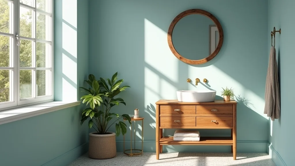
14 Bold Color Combinations That Will Make Your Home Stand Out!

Are you ready to breathe new life into your home? Bold color combinations have a magical way of transforming dull spaces into energetic havens. This post was created because I’ve seen countless homes miss out on their full potential simply due to a lack of creativity with paint and decor. If you find yourself endlessly scrolling Pinterest for inspiration or standing in a paint aisle overwhelmed by choices, this is the perfect guide for you.
Whether you’re a seasoned decorator or just starting to explore your personal style, this guide is for anyone eager to make a statement. You’ll discover 14 unique color combinations that not only stand out but also create a warm and inviting atmosphere in your home. By the end of this post, you’ll have a treasure trove of ideas to help you choose the perfect palette for every room, ensuring your home reflects your personality and style.
Let’s dive in and unleash the potential of color in your home!
Key Takeaways
– Explore 14 bold color combinations that will make your home memorable and inviting.
– Learn how to mix and match hues that create visual impact while maintaining harmony in your space.
– Find practical tips on choosing colors based on room purpose, lighting, and personal taste.
– Understand the emotional effects of colors and how they can influence the atmosphere of your home.
– Discover how to balance bold colors with neutrals to create a cohesive look without overwhelming your space.
How To Choose The Right Color Combinations
When it comes to selecting color combinations for your home, it can be a fun yet daunting task. Here are some key points to help you make the right choices:
1. Understand Color Theory: Familiarize yourself with the color wheel. Colors can be complementary (opposite each other), analogous (next to each other), or triadic (three evenly spaced colors). This understanding can guide you in creating harmonious palettes.
2. Consider Room Function: Think about how you want the space to feel. For example, calming colors like soft blues are great for bedrooms, while energetic colors like yellow can be perfect for kitchens or playrooms.
3. Assess Natural Light: Observe how light interacts with colors throughout the day. A color that looks stunning in bright sunlight may appear dull under artificial lighting. Test paint samples on your walls and observe them at different times of the day.
4. Use Neutrals as a Base: Bold colors can be overwhelming if used excessively. Incorporate neutral tones for walls or larger furniture pieces to balance out the vibrancy of bold accents.
5. Draw Inspiration from Your Surroundings: Look around for colors in nature, fabrics, or art that inspire you. Don’t hesitate to pull color ideas from your favorite pieces, as they can help create a personalized palette.
Pro Tip: Try creating a mood board with paint swatches, fabric samples, and pictures of decor styles you love. This visual representation can help clarify your vision!
How To Apply Bold Color Combinations in Your Home
Applying bold color combinations effectively can transform your space. Here’s how to do it:
Tools You’ll Need:
– Paint samples
– Painter’s tape
– Brushes and rollers
– Color wheel or palette guide
– Mood board (optional)
Step 1: Choose Your Base Color
Select one main color that will dominate the space. This can be a lighter shade to create a welcoming feel or a dark hue for a dramatic effect.
✔ Test samples on your wall to see how they look in various lighting.
Step 2: Pick Accent Colors
Choose 2-3 accent colors that complement your base. These can be bold shades or softer hues that add depth.
✔ Use the color wheel as a guide to select complementary colors.
Step 3: Use Painter’s Tape
Before painting, apply painter’s tape to create clean lines. This will help define areas where different colors will meet, giving you a professional finish.
✔ Press down the edges of the tape to prevent paint from bleeding underneath.
Step 4: Begin Painting
Start with the base color, allowing it to dry completely before moving on to the accents. You can use brushes for detailed areas and rollers for larger spaces.
✔ Keep a wet cloth handy to wipe any mistakes before they dry.
Step 5: Add Decor Elements
Incorporate decor items like cushions, rugs, and artwork that feature your accent colors. This helps tie the room together and enhances the overall effect.
✔ Mix and match textures to create visual interest.
Step 6: Step Back and Evaluate
After everything is painted and decorated, take a moment to step back and view the entire room. Adjust any elements as needed to ensure balance and harmony.
✔ Don’t rush to finish; sometimes, living with the colors for a few days helps you see what works best.
⏱ Time: ~3-5 hours for a standard room | 💡 Tip: Consider enlisting friends or family for a fun, collaborative painting session!
How To Maintain Your Bold Color Combinations
Keeping your vibrant colors looking fresh can be just as important as choosing the right ones. Here’s how to maintain their beauty:
1. Regular Cleaning: Dust and dirt can dull the brightness of your colors. Use a soft cloth or microfiber duster to regularly clean surfaces and walls.
2. Touch Up Paint: Over time, walls may get scuffs or chips. Keep some extra paint on hand for quick touch-ups. This will help maintain a polished look in your home.
3. Rotate Decor Accents: Change out decorative items periodically to keep your space feeling fresh. Swap cushions or artwork with seasonal colors that complement your bold palette.
4. Monitor Lighting: Change bulbs to warmer or cooler tones depending on your color scheme. The right lighting can enhance or diminish the vibrancy of your colors.
5. Avoid Overcrowding: Keep your decor minimal to allow bold colors to shine. Too many competing hues can lead to visual clutter.
Pro Tip: If you notice any color fading, consider using a UV-protective spray on fabrics or changing your window treatments to reduce sun exposure.
1. Teal and Mustard Yellow

The vibrant combination of teal and mustard yellow brings a delightful energy to any space. This pairing works well because teal’s calming essence harmonizes beautifully with the cheerfulness of mustard yellow, creating a look that is both refreshing and sophisticated. For instance, consider a teal accent wall paired with mustard yellow throw pillows to create a warm, inviting atmosphere.
To implement this color scheme, think about neutral furniture that can help these bold colors pop even more. You can also source budget-friendly decor at local thrift stores or online marketplaces to find unique items that fit this aesthetic.
Consider these ideas to fully embrace this vibrant palette:
– Pair teal sofas with mustard yellow accent chairs.
– Install mustard yellow curtains against teal walls for a cohesive look.
– Use teal and mustard in artwork to tie the colors together.
This combination not only enhances visual appeal but also adds a playful touch to your home with its rich textures and lively colors.
Teal and Mustard Yellow
Editor’s Choice
Price updated on December 20, 2025 at 6:30 PM

SARO LIFESTYLE Flower Design Poly Filled Throw Pillow, Teal, 13″

Mustard Yellow Gold Velvet Curtain 84 Inch Long 2 Panel for Living Room …

Mustard Yellow Solid Panel Curtains, 63 Inches Long, Set of 2, 100% Cott…

COLAMY Modern Wingback Living Room Chair, Upholstered Fabric Accent Armc…

Lexicon 360 Degree Swivel Accent Chair, Modern Comfy Velvet Round Barrel…
2. Coral and Navy Blue

The gorgeous duo of coral and navy blue creates a stunning contrast that can elevate your home’s ambiance. Coral infuses warmth and a welcoming glow, while navy offers a calming depth, making it ideal for spaces where relaxation and conversation are key. Imagine coral wall art juxtaposed with navy furnishings for a dynamic yet inviting environment.
To make the most of this combination, consider incorporating budget-friendly coral accessories, like throw pillows or framed art, alongside navy larger pieces like sofas. This look connects to broader trends that embrace bold contrasts while maintaining a cozy feel.
Here are some ways to use this color pairing:
– Choose coral as a statement wall color or in textiles.
– Incorporate navy through larger furniture or window treatments.
– Add gold accents to enhance sophistication and warmth.
This pairing not only ignites visual interest but also creates an inviting atmosphere, perfect for any home setting.
Coral and Navy Blue
Editor’s Choice
Price updated on December 20, 2025 at 6:30 PM

SARO LIFESTYLE Neptunian Coastal Throw Pillow – 20” x 20”, Woven Cotton …

Framed Coastal Coral Wall Art for Living Room, Large Navy Blue Watercolo…
Framed Coastal Coral Watercolor Wall Art for Living Room, Large 3 Piece …

Large Framed Coral Wall Art – Navy Blue Coastal Wall Decor Painting 16″x…

Kate and Laurel Sylvie Beaded Sophisticated Neutral Coral Blue 1 and Sop…
3. Emerald Green and Blush Pink
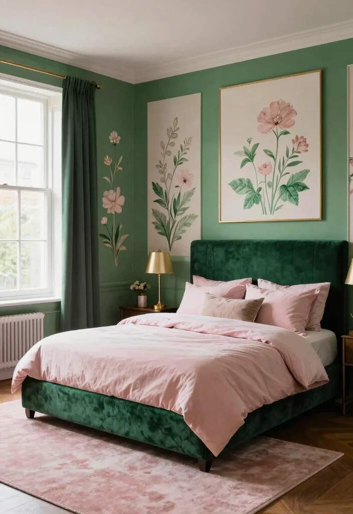
The enchanting blend of emerald green and blush pink brings a romantic elegance to your spaces. Emerald offers a luxurious feel reminiscent of lush landscapes, while blush pink adds warmth, making it approachable and inviting. This pairing is perfect for intimate spaces like bedrooms or cozy living rooms. Imagine a deep emerald wall adorned with blush-colored decor for a serene retreat.
For practical use, consider introducing blush accents through smaller decor items, which can easily be swapped out if you want a fresh look. Layering in light wood tones can also help ground this beautiful combination and tie the elements together seamlessly.
Explore these implementation ideas:
– Use emerald as a focal point on walls or in large furniture pieces.
– Opt for blush in smaller accessories like cushions or throws.
– Incorporate metallics like gold to elevate the sophistication of the scheme.
This color combination not only enhances the aesthetic but also creates a cozy, welcoming vibe through its rich textures and harmonious tones.
Emerald Green and Blush Pink
Editor’s Choice
Price updated on December 20, 2025 at 6:30 PM

TEIPAI Emerald Green and Gold Wall Decor for Living Room, 7PCS Modern Me…

Green and Gold Wall Decor Tropical Plant Gold Leaves Pictures Canvas Pri…

YHCTHT Abstract Emerald Green Canvas Wall Art Set of 3 – Modern Green an…

VisionaryBrush Framed Emerald Green Wall Art, Abstract Marbled Canvas Wa…

Madison Park Ruched Luxury Throw Premium Soft Cozy Brushed Long Faux Fur…
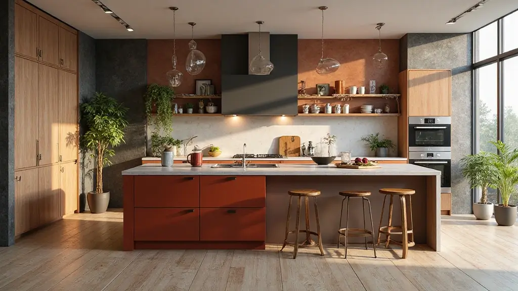
4. Charcoal Grey and Bright Red

If you crave boldness, the striking combination of charcoal grey and bright red is sure to command attention. Charcoal serves as a sophisticated backdrop that grounds the space, while bright red injects a dose of energy and passion. This aesthetic is particularly well-suited for creative spaces or home offices where inspiration thrives. Picture grey walls complemented by vibrant red accents for a dynamic environment.
To effectively use this color pairing, focus on using grey for larger pieces and sprinkle bright red throughout in decorative items or furniture to keep a balanced feel. Consider modern textures like faux leather for added depth and richness to your design.
Here are some ideas to implement this palette:
– Use grey on walls and larger furniture items.
– Introduce bright red through artwork or an accent chair.
– Mix in black or metallics to enhance the modern vibe.
This combination not only creates a visually striking space but also instills a sense of motivation and creativity through its contrasting textures.
Fun fact: Bold charcoal grey is one of the color combinations that can boost perceived energy in a workspace by up to 20%. The charcoal acts as a calm backdrop, while red injects focus—perfect for a creative home office.
Charcoal Grey and Bright Red
Editor’s Choice
Price updated on December 20, 2025 at 6:28 PM

EVOLVE Signature Paint & Primer: Luxury Paint & Primer for Indoor & Outd…

Rust-Oleum Charcoal Chalked All-in-One Ultra Matte Paint | One Coat Cove…

Country Chic All-in-One Chalk Paint for Furniture, Cabinets, Home Decor,…

Roundhill Furniture Blended Leather Tufted Accent Chair with Oversized S…
Merax Red Accent Chair, Fabric Armchair Mid Century Modern Chair Set of …
5. Lavender and Sage Green

For a tranquil and nature-inspired atmosphere, the combination of lavender and sage green offers a serene escape. Lavender’s soft tones promote relaxation, while sage green anchors the palette with its earthy quality. This pairing is ideal for spaces like bedrooms or bathrooms, where a calm vibe is essential. Imagine lavender walls adorned with sage green decor to create a soothing retreat.
To achieve this look, consider using lavender paint or wallpaper and accessorizing with sage green towels or cushions to enhance the peaceful ambiance. Adding natural elements like plants can further uplift the atmosphere and connect the indoor space with nature.
Here are some ways to use this soothing palette:
– Include lavender on walls or soft furnishings.
– Layer in sage green through towels, throws, or plants.
– Use soft, natural textures for added warmth and comfort.
This combination not only promotes relaxation but also enhances the overall design through its gentle color interplay and organic textures.
Lavender and Sage Green
Editor’s Choice
Price updated on December 20, 2025 at 6:32 PM
DWIL Matte Finish Furniture Paint – 16 Oz Wood Paint for Cabinets, Doors…
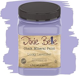
Dixie Belle Paint Company Chalk Finish Furniture Paint – Lucky Lavender …

PRESTIGE Paints Interior Paint and Primer In One, 1-Gallon, Flat, Compar…

Bedsure Sherpa Fleece Throw Blanket for Couch – Herringbone Pattern Room…
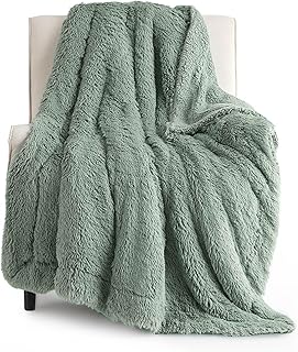
Bedsure GentleSoft Fluffy Sage Green Throw Blanket, Sage Green Decor for…
6. Black and Gold

For a sophisticated and glamorous touch, the classic pairing of black and gold stands out. Black brings depth and elegance, while gold adds a touch of luxury that can elevate any room. This color scheme is perfect for dining areas, living rooms, or even bathrooms, where you want to make a lasting impression. Picture black furniture set against gold accents for a chic and opulent vibe.
When using this luxurious palette, consider incorporating black through furniture or accent walls, then use gold in light fixtures or decorative accessories to bring warmth and shine. Textures like velvet or silk can also enhance the luxurious feel of the space.
Explore these ideas for implementing this striking combination:
– Balance black features with ample lighting or white accents.
– Use rich fabrics like velvet for added sophistication.
– Incorporate geometric patterns for a modern twist.
This combination not only adds glamour but also creates a timeless appeal through its rich textures and elegant contrasts.
Fun fact: Black and gold color combinations can boost perceived luxury by up to 30%. Pair a matte black palette with shimmering gold finishes for dining areas and you’ll notice guests comment on the opulent glow and timeless elegance.
Black and Gold
Editor’s Choice
Price updated on December 20, 2025 at 6:32 PM

GIGIZAZA Decorative Throw Pillow Covers 18 x 18,Gold Black Soft, Set of …

Gold Table Lamps Set of 2, Metal Modern Bedside Lamp with White Fabric S…

Touch Control Table Lamps Set of 2, Modern Gold Bedside Lamps with USB A…

Shag Rugs for Living Room 8×10: Geometric Fluffy Rug for Living Room- 8x…

5×7 Area Rug for Living Room, Black Fluffy Rug for Bedroom, Geometric Sh…
You might also like
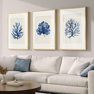
7. Soft Blue and Crisp White

For a refreshing and airy look, soft blue paired with crisp white is an excellent choice. Soft blue evokes a serene, breezy atmosphere, while white enhances the brightness and openness of your space, making it perfect for smaller rooms. Consider painting your kitchen walls a gentle blue and pairing it with white cabinetry for a cohesive, tranquil look.
To implement this combination effectively, think about using various shades of blue to create depth, and incorporate natural textures like wood to add warmth. Plants or fresh flowers can also bring an extra layer of life to your decor.
Here are a few actionable ideas:
– Use soft blue for walls or upholstery.
– Incorporate white in cabinetry, furniture, or trim.
– Add greenery to create a refreshing, lively atmosphere.
This pairing not only creates a clean aesthetic but also enhances the overall ambiance with its soothing colors and natural elements.
Soft Blue and Crisp White
Editor’s Choice
Price updated on December 20, 2025 at 6:32 PM

ARTZON Large Wall Art for Living Room Botanical Flower Canvas Print Blue…

Abstract Canvas Wall Art for Living Room Blue and White Prints Decor for…

WRFON Hydrangea Wall Art, Blue Floral Wall Decor, Blue Watercolor Botani…

Wieco Art 3 Piece Blue Ocean Bottom Canvas Wall Art for Living Room Beac…

Annie Sloan Satin Paint (Pemberley Blue, 25 Fl Oz/750 mL). Soft sheen fo…
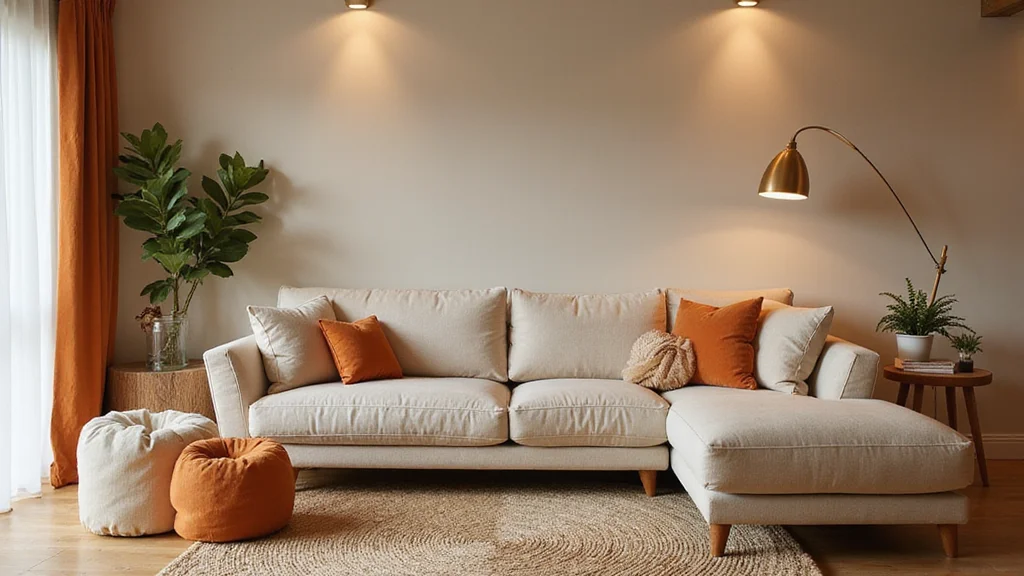
8. Bold Orange and Soft Grey

For those seeking a fun and uplifting vibe, the combination of bold orange and soft grey is a fantastic option. Orange brings enthusiasm and warmth to a space, while soft grey provides a neutral base that allows orange to shine without being overwhelming. This pairing works beautifully in living rooms or playrooms, creating a lively, inviting atmosphere. Imagine orange accent chairs set against soft grey walls for a playful look.
To effectively use this combination, keep soft grey as your primary color and introduce bold orange through accessories like throws or artwork to maintain balance. Incorporating natural wood elements can also help ground the design and add an organic feel.
Consider these implementation strategies:
– Use soft grey as your main wall color.
– Incorporate orange in decorative accessories or textiles.
– Mix in wooden elements for added warmth.
This combination not only brightens up your space but also creates a cheerful environment through its vibrant hues and inviting textures.
Bold Orange and Soft Grey
Editor’s Choice
Price updated on December 20, 2025 at 6:32 PM

DREAMNINE Decorative Fuzzy Soft Fall Bubble Faux Fur Throw Blanket for C…

Bedsure Gentlesoft Sherpa Fleece Throw Blanket for Couch – Fluffy & Cozy…

Bedsure GentleSoft Fluffy Burnt Orange Throw Blanket Fall Decorations fo…

CozeCube Orange Throw Blanket for Couch, Soft Cozy Cable Knit Throw for …

Chunky Cable Knit Throw Blanket Lightweight Burnt Orange 100% Organic Co…
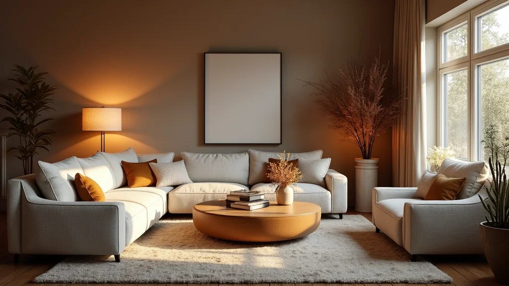
9. Deep Purple and Gold

For a touch of regality, the pairing of deep purple with gold is simply exquisite. Deep purple conveys a sense of luxury and sophistication, while gold accents introduce glamour and shine. This combination is ideal for formal spaces like dining rooms or studies where you want to impress and create a lasting impact. Imagine deep purple walls complemented by gold fixtures for an elegant atmosphere.
To utilize this stunning palette, consider using deep purple for accent walls or larger furniture pieces, and incorporate gold through decorative accessories or lighting to enhance the opulence of the space. Layering fabrics can also add warmth and richness to your design.
Here are some ways to implement this luxurious color scheme:
– Balance deep colors with lighter accents or textures.
– Incorporate layers of fabric for added warmth and comfort.
– Use statement art pieces that feature both colors for a cohesive look.
This combination not only elevates the design but also instills a sense of grandeur through its striking contrast and rich textures.
Deep Purple and Gold
Editor’s Choice
Price updated on December 20, 2025 at 6:32 PM

Gold Sputnik Chandeliers Modern LED Linear Chandelier Light 4 Light Pend…

6-Light Modern Gold Sputnik Chandelier Mid Century Brushed Brass Light F…
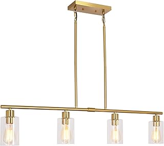
Modern Gold Kitchen Island Chandelier 4-Light Brushed Brass Farmhouse Pe…

Heart Pillow Purple Throw Pillows Decorative Pillows for Bed Couch Cute …

Purple Harmony Pillow – Standard – Medium, Greatest Pillow Ever Invented…
10. Bright Pink and Mint Green

For a lively and youthful atmosphere, bright pink and mint green create an energetic yet charming look. Bright pink injects fun and whimsy into a space, while mint green offers a refreshing touch of tranquility. This combination shines in children’s rooms or play spaces, inspiring creativity and joy. Imagine mint green walls adorned with bright pink decor elements for a cheerful vibe.
To effectively use this playful palette, consider using bright pink sparingly to maintain balance, and incorporate white for a clean backdrop. Adding playful patterns in textiles can also enhance the overall look.
Here are some tips for using this vibrant pairing:
– Use bright pink in small decor elements to avoid overwhelming the space.
– Incorporate mint green in larger areas, like walls or furniture.
– Mix in playful patterns for added interest.
This combination not only energizes your home but also creates an inviting space through its joyful colors and lively textures.
Fun fact: bold color combinations like bright pink and mint green boost mood and creativity in kids’ spaces. Start with mint walls, sprinkle bright pink accents, and keep a calm balance with neutrals—your child’s room becomes lively without feeling chaotic.
Bright Pink and Mint Green
Editor’s Choice
Price updated on December 20, 2025 at 6:34 PM
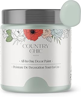
Country Chic All-in-One Chalk Paint for Furniture, Cabinets, Home Decor,…

PRESTIGE Interior Paint and Primer in One, Mint Frost, Semi-Gloss, 1 Gallon

PRESTIGE Paints Interior Paint and Primer In One, 1-Gallon, Semi-Gloss, …

FUTEI Hot Pink Chenille Throw Pillow Covers 18×18 Inch Set of 2,Soft Coz…

HIG Set of 2 Pink Ruched Velvet Round Throw Pillows – 14.5’’ Decorative …
11. Beige and Burgundy

For a cozy and grounded look, the pairing of beige and burgundy is a wonderful choice. Beige serves as a warm neutral backdrop, while burgundy adds depth and richness, making it ideal for inviting spaces like living rooms or libraries. Picture beige walls adorned with burgundy furniture for a harmonious and comforting vibe.
To implement this combination, consider using beige for your walls and layering in burgundy through furniture or accents like throws and pillows. Adding textures like knit blankets can also enhance the warmth and coziness of the space.
Here are some actionable ideas:
– Layer in textures like soft linens or knitted throws.
– Incorporate wooden elements to add classic touches.
– Use brass or gold accents for a hint of glamour.
This combination not only creates a warm atmosphere but also enriches the overall design with its inviting colors and tactile elements.
Beige and Burgundy
Editor’s Choice
Price updated on December 20, 2025 at 6:33 PM

Bigacogo Chunky Knit Throw Blanket for Couch, 40×60 inches, 100% Hand Kn…
Chunky Cable Knit Throw Blanket Lightweight Beige 100% Organic Cotton Bl…

BATTILO HOME Beige Throw Blanket for Couch, Knitted Beige Throw for Bed,…

Loloi Chris Loves Julia Poe Collection PCJ0019 Burgundy 18” x 18” Cove…
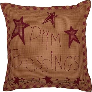
VHC Brands Ninepatch Star Prim Blessings Pillow 12×12 Country Bedding Ac…
You Might Also Like
12. Yellow and Grey

Brighten your home with the uplifting duo of yellow and grey. Yellow infuses joy and energy, making spaces feel lively and warm, while grey adds sophistication and balance. This pairing is ideal for kitchens or family rooms where a cheerful yet refined atmosphere is desired. Imagine yellow accents in curtains or tableware against a grey backdrop for an appealing contrast.
To effectively use this combination, consider painting your walls in a pale grey to enhance brightness and adding pops of yellow in decor elements to maintain balance. Incorporating plants can also bring life and freshness to the space.
Here are some ways to implement this vibrant palette:
– Use pale grey as a base to keep the space feeling light.
– Add yellow in small decor pieces to avoid overwhelming the design.
– Incorporate greenery for added vibrancy and freshness.
This color combination not only brightens your home but also enhances the overall atmosphere with its cheerful hues and refreshing touches.
Yellow and Grey
Editor’s Choice
Price updated on December 20, 2025 at 6:34 PM

Decorative 3D Flower Throw Pillow Covers Soft Velvet Handmade Pillowcase…
BlissBlush Yellow Mustard Decorative Throw Pillow Cover 20×20 Square Boh…

Decorative 3D Flower Throw Pillow Covers Accent Floral Pillowcases for C…

2 Pcs Flower Pillow, Yellow White Daisy Flower Throw Pillows Set, Cute P…

Heart Pillow 23.6″ Yellow Heart Shaped Pillow Decorative Throw Pillow Cu…
13. Seafoam Green and Tan

For a relaxed, beachy vibe, seafoam green paired with tan creates a serene and inviting atmosphere. Seafoam green offers a refreshing quality reminiscent of coastal views, while tan provides an earthy grounding element, perfect for creating coastal-inspired spaces. Imagine seafoam green walls enhanced by tan wooden furniture for a harmonious look.
To effectively utilize this combination, consider using seafoam green in larger elements, such as walls or sofas, and incorporating tan through furniture or decor items. Layering textures, like linen or rope, can amplify the beachy theme and enhance the overall design.
Here are some ideas to enhance this palette:
– Layer in textures like rope or woven baskets for added interest.
– Use white accents to enhance the coastal feel.
– Incorporate natural elements like driftwood for authenticity.
This combination not only creates a relaxing atmosphere but also infuses your home with a refreshing coastal charm through its soothing colors and textures.
Seafoam Green and Tan
Editor’s Choice
Price updated on December 20, 2025 at 6:33 PM

MIULEE Decorative Linen Pillow Covers 20×20 Inch Aqua Green Boho Farmho…

MIULEE Pack of 2 Couch Throw Pillow Covers 18×18 Inch Aqua Green Farmhou…
Phantoscope Pack of 2 Farmhouse Decorative Throw Pillow Covers,Solid pat…

JWH Velvet Flower Throw Pillow Cover Decorative 3D Sunflower Accent Pill…

Sea Team 3-Pack Large Storage Basket Set, Trunk Organizer, Clothes Toys …
14. Cream and Cobalt Blue

For an elegant yet bold contrast, the pairing of cream and cobalt blue creates a timeless look that shines in formal spaces like dining rooms or sophisticated lounges. Cream’s softness beautifully balances the striking vibrancy of cobalt blue, making it perfect for creating focal points. Picture cream walls united with cobalt blue furniture or decor elements to achieve a chic vibe.
To implement this striking palette, focus on using cobalt in larger pieces for impact, while layering in textures through throw pillows or art to add interest. Metallic elements can also enhance the glamour of this combination, creating a polished look.
Consider these ideas for this sophisticated pairing:
– Use cobalt in larger furniture pieces for a bold statement.
– Layer in textures with throw pillows or decorative items.
– Incorporate metallic accents for an added touch of elegance.
This combination not only elevates your space but also enhances the overall aesthetic through its rich contrast and luxurious textures.
Cream and Cobalt Blue
Editor’s Choice
Price updated on December 20, 2025 at 6:33 PM

Decorative Velvet Throw Pillow Covers for Sofa Couch Bed Chair, Embroide…

BlissBlush Dark Blue Decorative Throw Pillow Covers 18X18, Set of 2, Boh…

Fumete 2 Pcs 14 Inches Knot Pillow Round Throw Soft Plush Knot Ball Pill…
Xiashrk Knot Pillow, Decorative Throw Pillows with Soft Plush for Couch,…
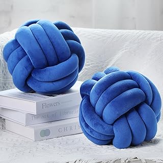
Namalu 2 Pcs Soft Knot Pillow Ball, Decorative Round Throw Knotted Pillo…
Conclusion

Embracing bold color combinations can completely transform your home, making it a true reflection of your style.
These vibrant pairings not only enhance the aesthetics of a room but also create an inviting atmosphere where memories can be made.
Whether you lean towards dramatic contrasts or soft harmonies, there’s a perfect color scheme for everyone. Now, which color combo will you choose to make your home stand out?
Note: We aim to provide accurate product links, but some may occasionally expire or become unavailable. If this happens, please search directly on Amazon for the product or a suitable alternative.
This post contains Amazon affiliate links, meaning we may earn a small commission if you purchase through our links, at no extra cost to you.
Frequently Asked Questions
What are some bold color combinations that can make a room pop without clashing with furniture?
Bold color combinations can instantly energize a space. For a striking look that still works with furniture, try: 1) Navy + blush pink + brass accents; 2) Emerald green + charcoal gray + warm wood; 3) Teal + mustard yellow + crisp white; 4) Rich plum + sage + metallics.
Start with a neutral base and bring in color with accessories, pillows, and artwork. Use the color wheel to pair complementary or analogous tones and keep the dominant color balanced with a few bold accents.
Remember, it’s about intentional color combinations and you should test swatches in real light before committing.
How do I choose color combinations for different rooms while keeping cohesive style?
To keep a cohesive look across rooms while using bold color combinations, start with a shared neutrals palette and pick one unifying accent color for the whole home. Use the 60-30-10 rule: 60% base neutrals, 30% secondary color, 10% bold accent. Consider lighting in each room and set a mood—calm in bedrooms, inviting in living spaces. Choose one unique color per room and repeat a subtle version of it in textiles, art, or hardware to tie spaces together. Always sample swatches in-place and review under different lights to ensure the color combinations feel right before painting or buying.
Which color combinations help make small spaces feel larger and brighter?
Small spaces benefit from light, cool neutrals with a bold accent to create depth. Try combinations like crisp white walls with a saturated accent color (turquoise, coral, or sunny yellow). Pair with glass or mirrored surfaces to reflect light. Use color combinations that lean toward analogous hues on the lighter side to avoid overwhelm. Add white ceilings, light wood, and minimal furniture to maximize perceived space. Test swatches on a large section of wall at different times of day; ensure the lighting enhances the chosen color combinations.
How can I incorporate bold color combinations on a budget?
You don’t need a full repaint to get a bold look. Start with affordable updates that showcase color combinations: swap cushions, throws, and curtains; add a statement rug; hang bold artwork; update hardware. Paint one accent wall first, using a high-quality paint in your chosen bold color. Shop secondhand or discount decor in the same color family, and use removable decals or wallpaper accent for easy changes. Plan around a few key pieces to anchor the room so you can make a big impact without breaking the bank.
What are practical steps to test and implement color combinations in a home decor project?
Start by collecting inspiration and building a mood board focused on your color combinations. Get large swatches or sample pots and test them on your wall or large poster boards. Observe how the colors look under different lighting across the day. Create a mini plan for each room with a simple palette: neutral base, a secondary color, and one bold accent. Go step-by-step: paint one wall or switch out a few accessories first, then expand if you love the result. Seek feedback from family or friends and adjust as needed so the final results feel intentional and unique.
Related Topics
home decor
bold color combinations
color schemes
unique interiors
interior design
vibrant palettes
modern style
room makeovers
DIY decorating
color psychology
beginner friendly
seasonal trends
I love the color combos you shared! I recently painted my living room a bright teal with orange accents, and it really brightens up the space. What’s your favorite color combination for a cozy room?
Did you know that yellow can actually make you feel happier? I painted my kitchen yellow, and it feels like sunshine in there! What colors make you feel good?